Saturday, December 17, 2011
Monday, November 14, 2011
Eskimo Girl
The majority of my attempts at sketching with my tablet over the past few years have always not turned out very well. However, after changing a couple of settings on my tablet a few days ago, I've discovered that I can actually semi-decently sketch with it. Painting has been easy enough so long as I had a scanned in image, but I'm excited that I can actually begin sketching directly into my computer without my drawing looking terrible!
Sunday, November 13, 2011
Painting & Layout
Above is my layout, tonal, and final painting (done in gouache) for one of my painting assignments. The stones on the back wall were a last minute decision, which is why they aren't in the line drawing. Below is a layout I did weeks ago for my layout class. I decided to give a go at digitally painting it, mainly because digital painting is something I would like to improve on, and the only way for that to happen is to practice. :)
Friday, November 4, 2011
Photos & Sketches
I would probably consider Autumn to be my favorite season; I love when the leaves change color. Above are just two random photos I took on a walk a couple weeks ago. Below are a few sketches I did in downtown Oakville. I really need to start drawing from life more, so this is my start at that. This is essentially my first time going out and drawing buildings. I assume I will get better at it as I practice more. I much prefer doing these kinds of sketches as opposed to cafe sketches of people, which I suppose ties into how I really enjoy layout, but not so much character design.
Sunday, October 23, 2011
Thursday, October 20, 2011
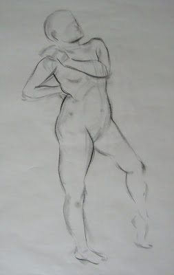
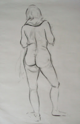
Life Drawings


Just an assortment of life drawings from the semester thus far, ranging from 30 seconds to 5 minutes. The model is pulling a scarf that is around her neck in this last one, in case that is unclear. Below is a skeleton drawing of an aye-aye I did at the ROM some weeks ago.
Monday, October 10, 2011
Painting
Below is our first painting assignment, which includes three color studies, a tonal, and the final painting. The small color studies and final painting were done in gouache, and the tonal was done in marker and white pencil crayon. I have to get back into the swing of painting as I am a bit out of practice.

Monday, October 3, 2011
Ava
Having finished most of the assignments that were due this week, I decided to use my free time to do a portrait. This here is a cousin of mine, which now makes the third portrait of a cousin I have put up on this blog, haha.
Saturday, October 1, 2011
Character Design
This was completed for a character design assignment. The design will be used in my next animation, which involves a
character lifting a heavy object and then throwing it. I don't think I was completely successful with the posing aspect of this assignment...I'm not sure if it looks like the object (a pot) is truly heavy, or if the character just seems to be faking her reaction to holding it. Regardless, I do like how this character has turned out - it will be interesting to see her animated.
Sunday, August 7, 2011
Harry Potter
I decided I'd draw one of the promotional posters for Harry Potter - I omitted the text because I felt it wasn't necessary for the drawing. I've been working on this on and off over the course of 2 or so weeks.
I used the grid method again to draw the outline. Despite what I had written in the Jack Johnson post when I first started doing portraits again, I really do prefer to use a grid than to not...especially when there is a lot going on. It's easy to run into trouble of fitting everything on the page if you're not using any form of measurements.
Even though Ron is the smallest of the three in this drawing, he gave me the most trouble; the angle made it difficult for me to draw and shade. I also didn't go too detailed on the background. In the poster, the bridge is of course more detailed and whatnot, but I really prefer just focusing on the characters. Plus, I would need a reeeally tiny pencil if I wanted to get it spot on.
Below is just a video with various photos I took along the way to show the work in progress.
Click here for the reference picture. :)
Friday, July 22, 2011
Zoo & Museum Sketches
I went to the Washington DC Zoo and the Smithsonian Museum of Natural History a few days ago with my mom - DC is close enough to home (1.5/2 hour drive) that it's nice to visit every once in a while! I particularly like the zoo because there is no admission cost (though there is no admission cost for the Smithsonian museums either). If I lived right in the area I'm sure I'd go there all the time to draw animals!
Below are just a couple (of many) photos I took while at the zoo, then below that are the sketches I did, none of which are anything special - it's all just practice. Sketching in pen is something I've only done a couple times before, so that was something relatively new for me. I'm a little rusty too because I have hardly drawn at all in the past two months due to being busy, and I don't feel like doing anything but relaxing with the free time I do have. I don't think any of these sketches exceeded 1 minute, I'd say most of them are around 30 seconds. I didn't sketch too much because it was hot, crowded, and I didn't have a stool or anything so any position I found myself drawing in was awkward and uncomfortable. I did quite a few of flamingo gestures because no one else was in that area, which gives me a much better peace of mind when it comes to sketching in public!
The Smithsonian also has great exhibits of skeletons. I didn't draw any, but there really is quite the selection if I ever do decide to sketch some of them. These two photos are just a very small taste of all the skeletons they've got on display.
Thursday, June 2, 2011
Serenity
As with my previous portrait of the baby, this is also a cousin of mine! I drew this on Smooth Bristol Board and will most likely continue drawing portraits on it. From just looking at these recent portraits and comparing them, it's not difficult to see the jump in quality that resulted from not drawing this in my sketchbook.
I actually decided to use a grid to draw the initial lineart for this because I wanted the proportions to be as close to the photograph as possible. Since I've done my past two portraits without a grid of any sort, I'm sure I could have pulled it off, but in the end I chose to do it this way. Also, I was bored and felt like taking the time to measure out everything and draw out the grid, so yeah!
Below are just some digital photos capturing my progress with this. They're all pretty dark photos, but it gets the idea across!
Monday, May 23, 2011
Baaaby
I drew this from a photo I had of a cousin of mine from when she was a baby. This and the Jack Johnson portrait have been done in my sketchbook; I'm not too much a fan of the texture that is picked up from drawing like this in my sketchbook, so I think I'll go buy some smooth Bristol paper some day or something of the sort, and see how much better I like that.
I hope I will be able to keep up with doing portraits once school starts again...though I have a feeling I will be too inundated with assignments to be able to make the time for this kinda stuff. I certainly don't want to go another 2 years of not doing a single one, I know that much!
I hope I will be able to keep up with doing portraits once school starts again...though I have a feeling I will be too inundated with assignments to be able to make the time for this kinda stuff. I certainly don't want to go another 2 years of not doing a single one, I know that much!
Subscribe to:
Posts (Atom)


