Below is the lineart, tonal and final painting done for my painting class. We had to choose a selection of text that described an interior, and create a layout/painting based on it. I ended up doing my piece based on a description in Christopher Paolini's book, Eragon.
And below is my animation done for the animal walk assignment. The inner structure I don't care for, but we needed to have it to some extent. If you disregard that I think it looks okay! I don't care too much for the extra animation at the end though either, I was just messing around, not seriously trying to do anything amazing...I dunno, so far I don't think animation is a favorite of mine. I'm thinking in the future I'll probably want to be a background painter. No idea though, things change, people change, you never know where you'll end up! I suspect that with more practice I'll gradually like animating more and more.Monday, March 28, 2011
Friday, March 25, 2011
Storyboarding & Layout Assignments
Below is an assignment done for our Storyboard Class. We had to choose a movie and board a selection of its scenes; I chose to do the Rugrats Movie.
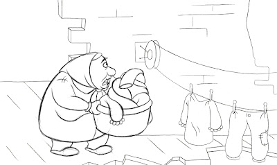
For the layout assignment shown below we were given a design package that included character and location designs, as well as the storyboard for the film. We basically had to pick three storyboard panels and redraw/refine them. These are all separated into the necessary levels...overlay, underlay, background, animation, etc. but I'm just showing the final composites here!
Saturday, March 19, 2011
Gardening Koalas and Exploding Flowers
First up is a character timeline assignment for Character Design class. I don't particularly care for this, but whaaatever.
Below is a background I did for a flash animation we were doing for an assignment in Digital Tools, and below that is the actual animation (the quality is a bit bad, but it will give you a 10 second dose of weirdness regardless). I definitely put more thought and time on the background than on the actual animation...but this was really my first time animating in flash anyway, so I decided I wouldn't focus so much on making nicely drawn animations if I hadn't even gotten the hang of the program yet!
Sunday, March 13, 2011
Life Drawings
30 seconds
1 minute
3 minutes
5 minutes
These are the life drawings I used for my recent life drawing portfolio. Considering these are the ones my teacher picked out to put in the portfolio, and are thus, some of my best, I've only taken pictures or these ones. Of course I have tons and tons more. I always find that many of the life drawings I'm not too fond of are the ones my teacher likes the most. Some of my fellow classmates feel the same way, it's interesting! But hey, I'd put his opinion in regards to life drawing above mine any day.
Sunday, March 6, 2011
Stuff, Stuff and More Stuff
First up is our most recent painting assignment. The whole idea of the assignment was to use the exact same layout, but paint with different colors to give off different moods. We had to use a triadic color scheme in one and an analogous color scheme in the other.
I don't particularly care for how I painted the water, I think I should practice painting clearer/more reflective water in the future. The assignment below is a layout assignment from a few weeks ago, nothing too special really.Next is a character sequence assignment done a few weeks back for my Character Design class. I decided to do a kiwi, who runs into a bit of trouble when he comes across...a kiwi. It's very simple, and I really didn't push myself with this assignment, but at least works.
And here we have the head rotation assignment for animation class. I ended up doing Denahi from Brother Bear. I feel as though mine is a bit off model, especially after the initial head rotations. The entire expression change at the end is really stupid and horridly animated, haha. I rushed it though, not because of procrastinating, more so because I just wanted it to be done with.
This next video is my first version of this assignment. In Brother Bear, Denahi starts to have this beard/goatee, of sorts (though it's not really either of those...) later on in the film. Anyway, my friend/classmate Andy was eager to have the expression change be him growing said beard. Haha, so I went along with it and (crudely) animated it. I showed it to our teacher, and just as I suspected, she was likeee "what?" Then she said she'd be screaming like that too if random hairs started to rapidly grow out of her face. YouTube really washed out the file, so it's a bit hard to see, but you get the idea!
Subscribe to:
Posts (Atom)